1.注释
注释代码 /内容/
2.样式调用
内联式>嵌入式>外部式 (就近原则)
内联式CSS写法:1
style=""
嵌入式CSS写法:1
2
3<style type="text/css">
//定义css
</style>
外部式CSS写法:1
<link herf="" rel="stylesheet" type="text/css" >
3.选择器
格式写法:1
2
3选择器{
//样式
}
1.子选择器:指定标签后的第一代子元素1
.food>li
2.后代选择器:指定标签后的所有子元素1
.food li
3.通用选择器:作用于全页面1
2
3
4*{
margin:0px;
padding:0px;
}
4.伪类选择器:(:)1
:link //伪类将应用于未被访问过的链接,与:visited互斥。
1 | :hover //伪类将应用于有鼠标指针悬停于其上的元素。 |
1 | :active //伪类将应用于被激活的元素,如被点击的链接、被按下的按钮等。 |
1 | :visited //伪类将应用于已经被访问过的链接,与:link互斥。 |
1 | :focus //伪类将应用于拥有键盘输入焦点的元素。 |
1 | :first-child //伪类将应用于元素在页面中第一次出现的时候。 |
1 | :lang //伪类将应用于元素带有指定lang的情况。 |
1 | :root //匹配文档的根元素,根元素只有html :root{}; |
1 | :not //选择除某个元素之外的所有元素input:not([type="submit"]){} |
1 | :empty //选择没有任何内容的元素 p:empty {display: none;} |
1 | :target //匹配文档(页面)的url的某个标志符的目标元素 |
例:1
2
3
4
5
6
7
8
9
10
11
12
13
14
15
16
17
18
19
20
21
22<h2><a href="#brand">Brand</a></h2>
<div class="menuSection" id="brand">content for Brand</div>
<h2><a href="#jake">Brand</a></h2>
<div class="menuSection" id="jake">content for jake</div>
<h2><a href="#aron">Brand</a></h2>
<div class="menuSection" id="aron">content for aron</div>
CSS代码:
#brand:target {
background: orange;
color: #fff;
}
#jake:target {
background: blue;
color: #fff;
}
#aron:target {
background: red;
color: #fff;
}
first-child:
last-child:
nth-child(n):
nth-last-child(n):
first-of-type:
nth-of-type(n):
last-of-type:
nth-last-of-type(n):
only-child //只有一个子元素时候使用
only-of-type //只出现一次的子元素
1 | :enabled选择器 //选中已启用的按钮input[type="text"]:enabled{} |
1 | :disabled //选中disabled 禁用的按钮input[type="text"]:disabled{} |
1 | :checked //被选中的 input 元素设置样式 input:checked{} |
1 | ::selection //被选中的文本元素设置样式 ::selection{} |
:read-only //选取设置了 “readonly” 属性的元素 input:read-only{}
:read-write //选取没有设置 “readonly” 属性的元素input:read-write{}
顺序:link→visited→hover→active
5.伪元素选择器(::)1
:first-letter //伪元素的样式将应用于元素文本的第一个字(母)。
1 | :first-line //伪元素的样式将应用于元素文本的第一行。 |
1 | ::before //在元素内容的最前面添加新内容。 |
1 | ::after //在元素内容的最后面添加新内容。 |
注意:
::before和::after其关键是依靠CSS3中的”content”属性来实现。
单冒号(:)用于CSS3伪类,双冒号(::)用于CSS3伪元素。
老版本用:,新版本用::
不过这个属性对于img和input元素不起作用。
content配合CSS的伪类或者伪元素,一般可以做以下四件事
功能 功能说明
none 不生成任何内容
attr 插入标签属性值
url 使用指定的绝对或相对地址插入一个外部资源(图像,声频,视频或浏览器支持的其他任何资源)
string 插入字符串
1 | a:after { |
6.多标签同样式用,隔开–不同的class内1
2
3h1,span{
//属性
}
7.多样式同标签用不隔开 紧挨着1
2
3.container.bg-fff{
//属性
}
8.属性值选择器:
1 | [title]{color:blue} //只要是title就显示蓝色 |
1 | [title="te"]{color:red;} //必须是te才显示红色 |
1 | [title~="title"]{color:green;} //只要含有title这个的就都显示绿色 |
9.相邻兄弟选择器:1
h1+p{}
10.样式权重
标签的权值是1
类选择器的权值是10
id选择器的权值最高是100
内联样式的权值为1000
*通配权值为0
!important最高权值
更多参考:http://www.cnblogs.com/webblog/archive/2009/07/07/1518274.html
4.文字排版
1.字体:
body{font-family:”微软雅黑”;}
缩写:
body{font:italt 12px/1.8em bold “宋体”}
引用自定义字体:1
2
3
4
5
6
7
8
9//定义
@font-face{
font-family:myfont;
src:url();
}
//引用
div{
font-family:myfont;
}
2.字号:body{font-size:20px; color:#666}
3.粗体:span{font-weight:bold;}
4.斜体:a{font-style:italic;}
5.font-variant:以小型大写字体或正常字体显示文本(把小写变大写,但是比其他字体都小一些)
6.下划线:a{text-decoration:underline;}
7.删除线:.oldPrice{text-decoration:line-through;}
8.段落缩进(不是整体向右缩进,只是这个段落的第一个字前加缩进) p{text-indent:2em} 缩进2个字符,可以为负值,text-indent:-2em;也可以按百分数缩进
9.行间距(行高):p{line-height:2em;} 也可以用百分号或者1.5
10.字符间距:h1{letter-spacing:20px;} //n e w
11.单词间距:h1{word-spacing:20px;} //holle world
12.对齐:div{text-align:center;} //居中 left/左对齐 right/右对齐
13.文本颜色: span{color:red}
14.文本方向:direction:ltr; //左至右 rtl/右至左
15.元素中的字母:text-transform:
capitalize(首字母变大写)
lowercase(全变小写)
uppercase(全变大写)
16.文本添加阴影:text-shadow:5px 5px 2px #ffc000;
背景距左距离,距当前文本上方距离,清晰度,颜色-四个属性
17.文本换行规则(不拆分英文单词):
word-wrap:normal; //断点换行
word-wrap:break-word; //长单词或者URL拆分换行–和下边break-all作用相同
18.文本换行规则(拆分单词):
word-break:break-all; //允许在单词内换行–和上边break-word作用相同
word-break:keep-all; //在半角空格或连字符处换行
19.强行不换行:white-space:nowrap;
20.单行超出部分隐藏,显示省略号1
2
3text-overflow:ellipsis;
overflow:hidden;
white-space:nowrap;
21.多行超出隐藏,显示省略号1
2
3
4
5overflow : hidden;
text-overflow: ellipsis;
display: -webkit-box;
-webkit-line-clamp: 2;
-webkit-box-orient: vertical;
5.块/内联元素
块级元素:1
<div><p><h1>~**<ol><ul><dl><table><adress><blockquote><form>
内联元素: 不独占一行1
<a><span><br><i><em><strong><label><q><var><cite><code>
内联块状元素: 独占一行1
<input><img>
内联元素转换成块状元素:
display:block;
块元素转换成内联元素:
display:inline;
内联块状元素(同时具备内联和块状元素的特点):
display:inline-block
让块元素排成一行,这里一定要注意,如果多处用这个会出现,上下不对齐的情况,要通过vertical-align:top;来上对齐
必须给第一个div设置了宽度,才能让第二个上去
他还会引起两个元素中间有空白,我现在是用注释解决的
还可以通过
①font-size:0;
②注释
③letter-spacing:-4px 来缩短字间距
6.盒模型
1.边框
1.边框格式:
border:2px solid red; //粗细、样式、颜色
边框样式:
border-style:dashed;(虚线)
border-style:dotted;(点线)
border-style:solid;(实线)
border-style:double;(双实线)
border-style:inset;(凹陷)
border-style:outset;(凸起)
border-style:ridge;(棱柱)
2.单边框样式: //所有单边框都这样设置
border-top-style:
border-bottom-style:
boder-left-style:
border-right-style:
3.边框颜色:
border-color;red;
4.边框宽度:
border-width:2px;
5.单边无边框
border-bottom:none; 这句话的意思是下边的边框是没有的,不占像素
6.圆角边框:
border-radius:10px //圆角角度为10px
7.单圆角边框:
border-top-left-radius: //左上角–其他以此类推
8.边框阴影:
box-shadow:10px 10px 5px #000;
背景距左距离,距当前块上方距离,清晰度,颜色-四个属性
X轴偏移量 Y轴偏移量 阴影模糊半径 阴影扩展半径 阴影颜色 投影方式
投影方式:inset-内部阴影/outset-外部阴影
多个阴影的时候用,隔开1
2
3.box_shadow{
box-shadow:4px 2px 6px #f00, -4px -2px 6px #000, 0px 0px 12px 5px #33CC00 inset;
}
9.边框图片:
border-image:
四个角分别对应了背景图片的四个角
2.填充
1.padding
padding:10px 20px 30px 40px;
padding-top:10px;
padding:right:20px;
padding:bottom:30px;
padding:left:40px;
2.margin
相邻的外边距合并:
margin的相邻边距合并,实际显示取最大值!!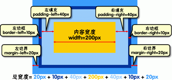
7.浮动模型
浮动会覆盖底层没有标有浮动属性的元素!
float:left;左浮动
float:right;右浮动
清除浮动:
方法一:
clear:both; //父级结束前的一个元素加这个属性
方法二:
overflow:hidden; //父级加这个属性
方法三: //less写法1
2
3
4
5
6
7
8
9
10
11
12.clearfix() {
*zoom: 1;
&:before,
&:after {
display: table;
content: "";
line-height: 0;
}
&:after {
clear: both;
}
}
方法四:1
display: flow-root
8.定位模型
1.绝对定位
position:absolute;
不占位置,很像漂浮
2.相对定位
position:relative;
只有块移动,但是内部元素是不变位置的(占位置)。
3.固定定位
position:fixed;
浮动在窗口的某个位置,不再变化,要定义上下左右至少1个元素
重点:relative和absolute组合使用,absolute一定要在relative内部操作,这样absolute才相对于relative移动位置
9.其他属性
overflow:设置元素溢出其区域发生的事情
clip:设置元素现实的形状
vertical-align 设置元素垂直对齐方式
z-index:设置元素的堆叠顺序1 2 3 谁大谁离用户最近
9.背景属性:
1.简写:1
background: #00FF00 url(bgimage.gif) no-repeat fixed top;
2.固定背景1
background-attachment:fixed
3.背景颜色1
background-color:
4.背景图片1
background-image:
5.背景位置1
background-position:left center;
包括了left/right/center/top/bottom五个属性,可以理解为x和y轴的设置,所以也可以填数值5px 6px以左上为准,还可以用10% 10%确定
注意:雪碧图一定要定义好要放背景的宽和高。定义位置是在挪动整张大图,让整张大图中要用那个图标正好显示在块级元素的框里,超出部分隐藏了而已。
6.背景平铺1
background-repeat:repeat/repeat-x/repeat-y/no-repeat
7.背景尺寸1
background-size:1000px 1000px;
cover:顾名思义为覆盖,即将背景图片等比缩放以填满整个容器;(等比拉长,两边都填满才结束)
contain:容纳,即将背景图片等比缩放至某一边紧贴容器边缘为止。(等比拉长,一边填满就结束)
8.背景定位1
background-origin:
border-box //相对于边框盒定位
padding-box //相对于内边距盒定位
content-box //相对于内容盒定位
9.背景绘制区域1
background-clip:
border-box //被裁剪到边框盒
padding-box //被裁剪到内边距盒
content-box //被裁剪到内容盒
10.背景渐变-Gradient
自定义方向(to bottom、to top、to right、to left、to bottom right,等等)。
如果有透明度请用RGBA
1.线性渐变(linear)
repeating-linear-gradient() 重复性线性渐变
linear-gradient() 普通线性渐变1
background: linear-gradient(direction, color-stop1 10%, color-stop2 80%, color-stop3 10%);
2.径向渐变(radial)
repeating-radial-gradient() 重复径向渐变
radial-gradient()1
background: radial-gradient(center, shape size, start-color, ..., last-color);
属性分别为:
1.渐变的位置 center/10% 50%/10px
2.形状(圆形circle或椭圆形ellipse)
3.大小 farthest-corner(到最远的角落)、closest-corner、closest-side、farthest-side
11.multiple backgrounds-多重背景
background : [background-color] | [background-image] | [background-position][*/*background-size] | [background-repeat] | [background-attachment] | [background-clip] | [background-origin],
注意:
用逗号隔开每组 background 的缩写值;
如果有 size 值,需要紧跟 position 并且用 “/” 隔开;
如果有多个背景图片,而其他属性只有一个(例如 background-repeat 只有一个),表明所有背景图片应用该属性值。
background-color 只能设置一个。
10.列表
1.简写列表项1
list-style:square inside url('/i/eg_arrow.gif')
分别为:list-style-type、list-style-position、list-style-image
2.列表类型1
list-style-type
none 无标记。
disc 默认。标记是实心圆。
circle 标记是空心圆。
square 标记是实心方块。
decimal 标记是数字。
decimal-leading-zero 0开头的数字标记。(01, 02, 03, 等。)
lower-roman 小写罗马数字(i, ii, iii, iv, v, 等。)
upper-roman 大写罗马数字(I, II, III, IV, V, 等。)
lower-alpha 小写英文字母The marker is lower-alpha (a, b, c, d, e, 等。)
upper-alpha 大写英文字母The marker is upper-alpha (A, B, C, D, E, 等。)
3.列表标志位置1
list-style-position
inside //文本以内
outside //文本以外
4.列表图像1
list-style-image:url("/i/arrow.gif");
前提:必须定义list-style-type
11.轮廓
1.简写轮廓属性1
outline:#00FF00 dotted thick;
分别为outline-color、outline-style、outline-width
2.设置轮廓颜色1
outline-color:red;
3.设置轮廓样式1
outline-style:groove(实线)double(双实线)dotted(虚线)
4.设置轮廓粗细1
lutline-width:2px;
#
12.鼠标类型1
cursor:auto;
cell //鼠标变成加号
alias //一个带有弧度的箭头
pointer //小手
13.可见度
1.占位隐藏1
visibility:hidden;
显示1
visibility:visible;
2.不占位隐藏1
display:none;
显示
display:block;
14.透明度
1.普通透明度1
opacity:0.5
2.带颜色的透明度1
background: rgba(0,0,0,0.5) //最后一位是透明度
15.动画
2d转换
1.translate()移动,且不影响在X、Y轴上的任何Web组件。1
transform:translate(100px,100px); //是让x移动100px,y轴移动100px
2.rotate()旋转1
transform:rotate(200deg); //旋转200度
3.scale()缩放,就是拉伸了1
transform:scale(1,2); //1是宽度,1倍是不变,2是高度,2倍
4.skew()倾斜1
transform:skew(50deg, 50deg); //X轴旋转角度,Y轴旋转角度
5.matrix()矩阵
是一个含六个值的(a,b,c,d,e,f)变换矩阵,用来指定一个2D变换,相当于直接应用一个[a b c d e f]变换矩阵。就是基于水平方向(X轴)和垂直方向(Y轴)重新定位元素,此属性值使用涉及到数学中的矩阵1
2
3
4
5
6
7
8.wrapper div {
width:300px;
height: 200px;
background: orange;
-webkit-transform: matrix(1,0,0,1,50,50);
-moz-transform:matrix(1,0,0,1,50,50);
transform: matrix(1,0,0,1,50,50);
}
6.transform-origin 原点位移
通过transform-origin来对元素进行原点位置改变,和元素设置背景中的background-position取值类似。1
2
3
4.transform-origin div {
transform-origin: left top;
transform-origin:20% 40%;
}
3d转换
1.rotateX() 元素围绕其 X 轴以给定的度数进行旋转1
transform: rotateX(120deg);
2.rotateY() 元素围绕其 Y 轴以给定的度数进行旋转1
transform: rotateY(130deg);
3.景深 perspective
默认为none1
2
3
4
5
6
7
8
9
10
11
12
13
14//最外层加上这个
perspective:100px 数值越大,看着越远
-webkit-perspective:100px
//3D和2D同时保留
transform-style: preserve-3d;
//在背面的时候隐藏
backface-visibility: hidden;
//但是
transform: rotateY(180deg); //我觉得完全没必要,直接让背面元素,就可以了啊
//3D属性
transform: translate3D(206px ,0 ,0) rotateY(180deg);
渲染效果
字体都是像素点组成的,所以字体边缘会不平滑,所以引擎采用了一些方法去处理这个不平滑。
灰阶渲染 控制轮廓的亮度来达到平滑效果
亚像素渲染 每个像素由rgb3个亚像素的颜色和亮度混合而成,垂直情况比灰阶渲染放大了三倍,所以效果更好,内存更多。(但是Mac下白色字体在深色背景下,会显得粗,所以还是采用灰阶渲染)1
2
3//兼容模式的灰阶渲染
-webkit-font-smoothing: antialiased;
-moz-osx-font-smoothing: grayscale;
16.过渡效果
1.简写:1
transition: width 2s linear 1s; //放在改变前属性内
2.过渡效果的 CSS 属性的名称1
transition-property:width;
3.过渡效果需要多少秒或毫秒1
transition-duration: 5s;
4.速度效果的速度曲线1
transition-timing-function: linear;
linear 规定以相同速度开始至结束的过渡效果(等于 cubic-bezier(0,0,1,1))。
ease 规定慢速开始,然后变快,然后慢速结束的过渡效果(cubic-bezier(0.25,0.1,0.25,1))。
ease-in 规定以慢速开始的过渡效果(等于 cubic-bezier(0.42,0,1,1))。
ease-out 规定以慢速结束的过渡效果(等于 cubic-bezier(0,0,0.58,1))。
ease-in-out 规定以慢速开始和结束的过渡效果(等于 cubic-bezier(0.42,0,0.58,1))。
cubic-bezier(n,n,n,n) 在 cubic-bezier 函数中定义自己的值。可能的值是 0 至 1 之间的数值。
5.过渡效果何时开始1
transition-delay: 2s;
注意:
有时我们想改变两个或者多个css属性的transition效果时,只要把几个transition的声明串在一起,用逗号(“,”)隔开,然后各自可以有各自不同的延续时间和其时间的速率变换方式。但需要值得注意的一点:第一个时间的值为 transition-duration,第二个为transition-delay。1
a{ transition: background 0.8s ease-in 0.3,color 0.6s ease-out 0.3;}
例:1
2
3
4
5
6
7div {
background-color:red;
transition: background-color .5s ease .1s;
}
div:hover { //这里是变化后的状态,transform也写在这里
background-color: orange;
}
17.动画效果
@keyframes 规定动画1
2
3
4
5
6
7
8
9
10
11
12
13
14
15
16
17
18
19@keyframes wobble {
0% {
margin-left: 100px;
background:green;
}
100% {
margin-left: 100px;
background: red;
}
}
div {
width: 100px;
height: 100px;
background:red;
color: #fff;
}
div:hover{
animation: wobble 5s ease .1s;
}
1.简写-所有动画属性的简写属性,除了animation-play-state和animation-fill-mode 属性。1
animation:mymove 5s infinite; //放在改变后的属性内
2.规定 @keyframes 动画的名称1
animation-name: keyframename;
3.规定动画完成一个周期所花费的时间。默认是 0。1
animation-duration:2s;
4.规定动画的速度曲线。默认是 “ease”。1
animation-timing-function:ease;
5.规定动画延时。默认是 0。1
animation-delay:2s;
6.规定动画被播放的次数。默认是 1。无限次播放infinite1
animation-iteration-count:infinite;
7.规定是否应该轮流反向播放动画。默认是 “normal”。来回播放alternate1
animation-direction:alternate;
8.规定动画是否正在运行或暂停。默认是 “running”,暂停是paused1
animation-play-state:running;
9.规定动画在播放之前或之后,其动画效果是否可见1
animation-fill-mode: forwards;
forwards 当动画完成后,保持最后一个属性值(在最后一个关键帧中定义)。
backwards 在 animation-delay 所指定的一段时间内,在动画显示之前,应用开始属性值(在第一个关键帧中定义)。
注意
一定要加上1
2
3
4
5
6
7
8.active{
-webkit-animation:myfirst 400ms forwards; /*这里也要加前缀*/
}
@-webkit-keyframes myfirst
{
from {-webkit-transform:rotate(90deg) scale(.5)}
to{-webkit-transform:rotate(180deg) scale(.5)}
}
18.多列
1.简写1
columns:100px 3; //设置列宽和列数
2.分裂的数量1
column-count:3;
3.每一列的间隔1
column-gap:50px;
4.每一条线的宽-样式-颜色1
column-rule:5px putset #fff0000;
column-rule-width、column-rule-style、column-rule-color
5.每一列的宽度1
column-width:250px;
6.横跨所有列-一般用于标题1
column-span:all;
19.Flex
1 | display: flex; |
flex-direction: column; //主轴为纵向
justify-content:center; //主轴对齐方式
align-items:flex-start; //交叉轴对齐方式
flex-wrap:nowrap //不换行 wrap换行
align-self: //子元素单独定义自己的align-items对齐方式,覆盖父元素交叉轴方向
align-content: //多跟轴线时对齐方式flex-start | flex-end | center
1 | flex:flex-grow flex-shrink flex-basis //简写:默认0 1 auto 还有两种写法auto指 1 1 auto另外一个是 none 指0 0 auto |
order:0 //默认为0 越小越靠前
flex-grow:1 //默认为0,放大比例可以用1 2 1 这种比例
flex-shrink:1 //默认为1,缩小比例,所有块都缩小
flex-basis:auto //占项目的大小,可以是数值350px
更多参考:http://www.ruanyifeng.com/blog/2015/07/flex-grammar.html
21.兼容性
-webkit- /safari chrome/
-ms- /IE/
-o- /opera/
-moz- /Firefox/
调用JS文件进行兼容:
prefixfree.js
21.Media Queries-媒体查询
值 设备类型
All 所有设备
Braille 盲人用点字法触觉回馈设备
Embossed 盲文打印机
Handheld 便携设备
Print 打印用纸或打印预览视图
Projection 各种投影设备
Screen 电脑显示器
Speech 语音或音频合成器
Tv 电视机类型设备
Tty 使用固定密度字母栅格的媒介,比如电传打字机和终端
其中Screen、All和Print为最常见的三种媒体类型。
媒体类型的引用方法也有多种,常见的有:link标签、@import和CSS3新增的@media几种:
1.link方法:
1 | <link rel="stylesheet" type="text/css" href="style.css" media="screen" > |
2.@import方法
1 | //在样式表里引用 |
3.@media方法
1 | //在样式表里引用 |
属性:
最大宽度max-width
多个媒体特性and
最小宽度min-width1
2
3@media screen and (min-width:600px) and (max-width:900px){
body {background-color:#f5f5f5;}
}
not关键词排除某种制定的媒体类型(取反)1
@media not print and (max-width: 1200px){样式代码}
only关键词
22.Responsive设计
1.流体网格–使用百分比单位来控制网格大小
2.弹性图片–不给图片设置宽度,一般设置成 max-width:100%;
断点解决图片自适应1
2
3
4
5
6
7
8
9
10
11
12<img src="image.jpg" data-src-600px="image-600px.jpg" data-src-800px="image-800px.jpg" alt="" >
对应的CSS代码:
@media (min-device-width:600px){
img[data-src-600px]{
content: attr(data-src-600px,url);
}
}
@media (min-device-width:800px){
img[data-src-800px] {
content:attr(data-src-800px,url);
}
}
3.媒体查询
4.屏幕分辨率
5.主要断点
主要断点,在Web开发中是一个新词,但对于Responsive设计中是一个很重要的一部分。简单的描述就是,设备宽度的临界点。在Media Queries中,其中媒体特性”min-width”和”max-width”对应的属性值就是响应式设计中的断点值。简单点说,就是使用主要断点和次要断点,创建媒体查询的条件。而每个断点会对应调用一个样式文件(或者样式代码),如下图所示: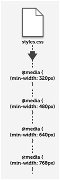
上图的style.css样式文件运用在Web页面中,但这个样式文件包括了所有风格的样式代码,也就是说所有设备下显示的风格都通过这个样式文件下载下来。当然,在实际中还可以使用另一种方法,也就是在不同的断点加载不同的样式文件,如下图所示。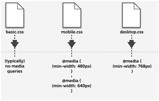
Responsive布局技巧
第一, 尽量少用无关紧要的div;
第二,不要使用内联元素(inline);
第三,尽量少用JS或flash;
第四,丢弃没用的绝对定位和浮动样式;
第五,摒弃任何冗余结构和不使用100%设置。
更好的布局
第一,使用HTML5 Doctype和相关指南;
第二,重置好你的样式(reset.css);
第三,一个简单的有语义的核心布局;
第四,给重要的网页元素使用简单的技巧,比如导航菜单之类元素。
###
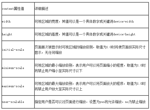
meta标签
1 | <meta name="viewport" content="width=device-width,initial-scale=1.0" > |
23.用户界面
1.自由缩放属性resize–随意调整可以使用overflow属性的所有容器元素1
2
3
4div{
resize:both;
overflow:auto;
}
none 用户不能拖动元素修改尺寸大小。
both 用户可以拖动元素,同时修改元素的宽度和高度
horizontal 用户可以拖动元素,仅可以修改元素的宽度,但不能修改元素的高度。
vertical 用户可以拖动元素,仅可以修改元素的高度,但不能修改元素的宽度。
2.外轮廓outline
和border边框属性的使用方法和效果极其相似,但是不占用网页布局空间
outline: [outline-color] || [outline-style] || [outline-width] || [outline-offset] || inherit1
outline:#00ff00 dotted 16px;
24.水平居中
1 | 内联元素: |
25.垂直居中
1 | 内联元素: |
26.实践补充
26.1 BFC
BFC规范-块级格式化上下文
1.BFC化后的盒模型内部的两个上下排列的盒模型的margin会合并
2.BFC的区域不会与float box重叠。
3.BFC就是页面上的一个隔离的独立容器,容器里面的子元素不会影响到外面的元素。
4.计算BFC的高度时,浮动元素也参与计算
BFC化的方法float的值不为none。overflow的值为auto,scroll或hidden。display的值为table-cell, table-caption, inline-block中的任何一个。position的值不为relative和static。
BFC的限制和兼容overflow:hidden;会产生显示不全的效果display:inline-block只能根据包裹元素收缩,只有IE6/7下才会撑开整个宽度display:table-cell只有IE8以上支持,同样也只能根据包裹元素收缩,但是它还有一个特性来弥补这个缺点,就是你宽度值设置地再大,实际宽度也不会超过表格容器的宽度。所以将宽度设置成9999px或者100%就没问题了
因为table-cell这个特性,就可以实现三列自适应的局面了1
2
3
4
5
6
7
8
9
10
11
12
13
14
15
16
17
18.left_div, .mid_div, .right_div {
height: 200px;
display: table-cell;
}
.left_div {
width: 50%;
background: #369;
}
.mid_div {
//非IE识别的属性,(>=IE8)
min-width: 100px;
width: 100px;
background: #697;
}
.right_div {
width: 50%;
background: #126;
}
BFC的应用
1.两栏自适应,原理左边浮动,右边BFC化后就不会和左边重叠1
2
3
4
5
6
7
8
9
10.left {
width: 100px;
height: 150px;
float: left;
margin-right:20px; //右边间隙,如果右边盒子用用margin-left:20px是得不到同样效果的,必须将left的宽也加进来,为margin-left:20px才行
background: #f66;
}
.right{
overflow:hidden; //BFC化,这样就不会和左边重叠
}
改进通用版:1
2
3
4.right {
display: table-cell; width: 9999px;
*display: inline-block; *width: auto;
}
2.清除内部浮动,原理-在计算BFC的高度时,浮动元素也参与计算1
2
3
4
5
6.par{
overflow:hidden; //BFC化后,计算高度,这样子模块浮动的话,这个盒子也有高度了
}
.child{
float:left;
}
改进通用版1
2
3
4
5
6.clearfix {
*zoom: 1;
}
.clearfix:after {
content: ''; display: table; clear: both;
}
3.防止BFC化后的盒模型内部的盒子的上下margin重合
解决:内部两个盒子外边分别再套一个BFC化的盒模型
26.2 内容超出框后,出现滚动条
1 | overflow-y: scroll; |
26.3 去除表单前边符号
1 | list-style-type: none; |
26.4 隐藏元素,不占位
1 | display: none; |
26.5 隐藏元素,占位
1 | visibility:hidden; |
26.6 行缩进
1 | text-indent: -999em; |
这个的效果和overflow差不多,都是超出的部分隐藏,一般来隐藏字体,但是当隐藏字体的前提是它要是个块级元素,也可以设成font-size:0;
26.7 消除点击边框
1 | *:focus{outline:none;} |
消除所有浏览器自带的聚焦渲染效果,为实现自己想要的效果打基础
26.8 设置透明度
1 | filter:alpha(opacity=0.5) |
滤镜属性,设置透明度,这个主要针对IE,一般都是用opacity:0.5;
1 | background-color: rgba(0, 0, 0, 0.4); |
通过rgba来设置透明度,最后一位是设置
26.9 去除input点击时候的边框
1 | outline:none; |
26.10 修改placeholder颜色属性
1 | .sryzm input::-moz-placeholder { color: #cccccc; } |
26.11 footer保持在底部
1 | html,body{ |
缺点:输入框浮动的话,底部按钮会被挡住,而不是在输入框上边
第二种方法:
通过flexbox的对齐属性space-between1
.flexDir(row,wrap,center,center,space-between);
注意这个要用知道总高度才行,所以需要加上1
2
3
4
5.pa();
.top(0);
.bottom(0);
.left(0);
.right(0);
缺点:IOS8还不支持
第三种方法:
通过calc属性,用法和第一种差不多1
2
3
4
5
6
7
8
9
10.container{
height: 100%;
.content-top{
overflow: scroll;
height:calc(100% - 380*@px);
}
.content-bottom{
height:380*@px;
}
}
缺点:输入框浮上去的话,有可能会遮挡半个按钮,应该是写的不严谨造成的,容错不是很高
第四种方法:1
2
3
4
5
6
7
8
9
10
11
12
13
14
15
16
17
18
19
20
21
22.container{
// container 不绝对定位其实也可以
position: absolute;
top:0;
left:0;
right:0;
bottom:0;
.content-top{
position: absolute;
top:0;
left:0;
right:0;
bottom:110*@px; // 这个属性最重要,防止遮挡底部
overflow: scroll; // 超出滚动
}
.content-bottom{
position: absolute;
left:0;
right:0;
bottom:0;
}
}
暂时还没有发现大的问题
26.12 只显示首屏
1 | max-height:100%; |
html,body{height:100%}有这个前提,就可以只显示首屏了,其他部分隐藏掉,用在h5页面
26.13 允许独立的滚动区域和触摸回弹
1 | -webkit-overflow-scrolling: touch |
WebKit私有的属性
26.14 Chrome显示12号以下的字体-感觉失效了
1 | html,body{ |
26.15 修改option下的字体样式
1 | select option {font-size:12px; font-family:微软雅黑;} |
26.16 莫名的间距问题
1 | <span></span>中间有间距<span></span> |
是因为外层div没有设置字体大小,而span中间有空格,所以引起的,可以设置font-size:0;
26.17 初始化line-height
1 | html,body{line-height:1;} |
浏览器会自动给没有设置line-leight的边框添加默认值,火狐是15px,所以这里需要定义下
26.18 去除textarea的右下角三角和边框
1 | resize:none; |
26.19 换行属性说明
1 | pre { |
26.20 解决双边距问题
1 | margin-left:-1px; |
26.21 box-sizing
1 | input[type=”button”], input[type=”submit”], input[type=”reset”], input[type=”file”]::-webkit-file-upload-button, button 这些元素的box-sizing属性被浏览器默认设置为border-box; |
解决办法:box-sizing: content-box;
知识点:
border-box—border和padding计算入width之内
content-box—border和padding不计算入width之内
padding-box—padding计算入width内 (IE8+都不支持)
26.22 去除select默认箭头
1 | select { |
26.23 before after hover顺序
1 | .clearfix li:nth-of-type(1) :hover::before |
这两个是有区别的,如果没调出来可以换换,一般都是后加before
26.24 CSS点击跳转用法
1 | #bg1:target{ |
这里是#bg1.target或者slideLeft.target都行,这里前缀是跳转后那个的类或者id
26.25修改第一个或者最后一个元素样式
1 | .nav-menu > li:last-child |
一般都是用last-child和first-child来修改第一个和最有一个li的元素项。
26.26 隐藏选框,来做动画
1 | input[type=checkbox] { |
好像除了这个也可以用appearance:none;
26.27 两列自适应(右侧占100%)
1 | //方法一 |
26.28 三列自适应–table实现
1 | .father{ |
26.29 三列等宽中间有间距
1 | .wrap{ |
26.30 文件上传
1 | //html |
26.31 删除input[type=number]默认样式
1 | input[type=number] { |
26.32 解决苹果手机识别手机号变黑的问题
1 | //头部--禁用识别 |
26.33 禁止长按链接与图片弹出菜单
1 | a, img { |
26.34 禁止选中文本
1 | html, body { |
26.35 去掉webkit默认的表单样式
1 | button,input,optgroup,select,textarea { |
26.36 去掉a、input和button点击时的蓝色外边框和灰色半透明背景
1 | a,button,input,optgroup,select,textarea { |
26.37 修改webkit中input的planceholder样式
1 | input::-webkit-input-placeholder { |
26.38 修改webkit中focus状态下input的planceholder样式
1 | input:focus::-webkit-input-placeholder { |
26.39 禁止IOS调整字体大小
1 | body { |
26.40 隐藏Android的语音输入按钮
1 | input::-webkit-input-speech-button { |
26.41 自定义苹果图标
在网站文件根目录放一个 apple-touch-icon.png 文件,苹果设备保存网站为书签或桌面快捷方式时,就会使用这个文件作为图标,文件尺寸建议为:180px × 180px。
26.42 使用box-shadow改变(挡住)表单自动填充后的黄色
1 | input:-webkit-autofill, textarea:-webkit-autofill, select:-webkit-autofill{ |
26.43 flex布局less缩写
1 | .flexDir(@fd:row,@fw:nowrap,@jc:flex-start,@ai:center,@ac:center){ |
注意:这个外框里边必须是块级元素,input也要设置display:block,否则会有兼容问题
26.44 去除img间隙
1 | vertical-align:top; |
24.45 提高页面滚动、动画等渲染性能
1 | .style:hover { |
26.46 元素可以点透
1 | pointer-events:none; |
none:元素永远不会成为鼠标事件的target。但是,当其后代元素的pointer-events属性指定其他值时,鼠标事件可以指向后代元素,在这种情况下,鼠标事件将在捕获或冒泡阶触发父元素的事件侦听器。
26.47 隐藏移动端滚动条
前提:父元素也就是body,html必须包含overflow:scroll属性1
2
3::-webkit-scrollbar {
display: none;
}
引申问题及解决:
在子块中用:
如果子块不加overflow:scroll的话,触底加载会停止,不会继续加载,所以子块也要加这句。
又会出现滑动不流畅,需要在当前子块增加1
2overflow: scroll;
-webkit-transform:translate3d(0,0,0);
这样就完美解决了~
但是:
这样又会造成无限加载,而不是触底加载····尴尬
26.48 横向超出滚动
1 | white-space: nowrap; |
26.48 两端对齐
1 | text-align:justify |
26.49 fixed浮动bug
1 | position: sticky |
判断是否支持sticky1
2
3
4
5
6
7
8
9
10
11
12
13var sticky = (function () {
var vendorList = ['', '-webkit-', '-ms-', '-moz-', '-o-'],
vendorListLength = vendorList.length,
stickyElement = document.createElement('div');
for (var i = 0; i < vendorListLength; i++) {
stickyElement.style.position = vendorList[i] + 'sticky';
if (stickyElement.style.position !== '') {
return true;
}
}
return false;
})();
1 | function cssSupport (attr, value) { |
1 | var isSupportSticky = function() { |
26.50 getComputedStyle 和element.style 区别
只读与可写
正如上面提到的getComputedStyle方法是只读的,只能获取样式,不能设置;而element.style能读能写,能屈能伸。
获取的对象范围
getComputedStyle方法获取的是最终应用在元素上的所有CSS属性对象(即使没有CSS代码,也会把默认的祖宗八代都显示出来);而element.style只能获取元素style属性中的CSS样式。因此对于一个光秃秃的元素
,getComputedStyle方法返回对象中length属性值(如果有)就是190+(据我测试FF:192, IE9:195, Chrome:253, 不同环境结果可能有差异), 而element.style就是0。
26.51 占位图
1 | <button>Add content</button> |
1 | .demo:empty { |
1 | document.querySelector('button').addEventListener('click', function() { |
26.52 默认字体
1 | font-family: "Helvetica Neue", Helvetica, Arial, "PingFang SC", "Hiragino Sans GB", "Heiti SC", "Microsoft YaHei", "WenQuanYi Micro Hei", sans-serif; |
26.53 渐变字体+镂空字体
1 | // 渐变 |
1 | // 镂空 |
26.54 PC端模糊解决办法
原因一:去掉3d
translte3d(-50%,-50%,0) 改为translate(-50%,-50%)
原因二:用px代替%
translate(-50%,-50%)
改为
translate(-50px,-50px)
原因三:宽度为奇数
width:633px
改为
width: 634px
注意:PC开发尽量不用奇数
26.55 三角形
1 | //三角 |
26.56 图片地址不存在时bug
1 | img[src=""], img:not([src]) { |
26.57 点击闪烁+边框问题
1 | input,textarea,button{ |
26.58 防止滚动
CSS部分1
2
3
4
5
6
7.full-screen{
height:100%;
position:fixed;
top:0;
left: 0;
right: 0;
}
JS部分1
2document.body.classList.add('full-screen');
document.body.classList.remove('full-screen');
26.59 border-radius不生效
1 | -webkit-transform: translateZ(0); |
26.60 border-radius不生效
1 | transform: rotate(0deg); |
26.61 第一个字母样式
:first-letter选择器用来指定元素第一个字母的样式。
注意:display必须是inline-block才生效
CSS判断iphoneX
iPhone X 媒体查询适配
如何对iPhone X/8/8 Plus CSS媒体查询?
尺寸分辨率汇总
CSS文章集锦
安卓不居中问题
1 |
|
解决 Android 浏览器下 line-height 垂直居中偏离问题
白色渐变透明
1 | background: linear-gradient(to top, rgba(255,255,255,1) 0%,rgba(255,255,255,0) 100%); |